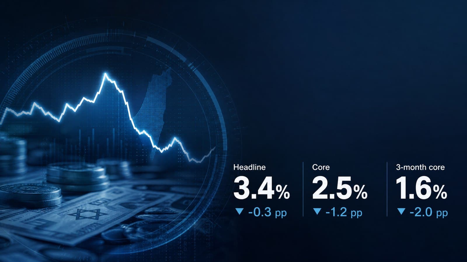
US consumer price index data for July 2026 was published today. The figures below were pulled directly from the Bureau of Labor Statistics series database.
Errors or inaccuracies are possible. Spotted something that looks wrong? Write to me and I will correct it.
The Numbers
| Over the year | Over the month | |
|---|---|---|
| Headline index | 3.4% | 0.1% |
| Core index | 2.5% | 0.2% |
| Energy | 14.5% | -1.5% |
| Food | 2.9% | 0.1% |
| Shelter | 3.2% | 0.1% |
| Services less energy | 3.0% | 0.2% |
| Core goods | 0.8% | 0.2% |
The monthly change is seasonally adjusted. The annual change is not - that is the conventional way to present it.
The Gap, and That Is the Whole Story
The headline index rose 3.4%. Core rose 2.5%. The difference is almost a full percentage point.
And that difference is precisely the definition of the core index: it removes food and energy, both of which are unusually volatile.
And the culprit is clear: energy rose 14.5% over the year. Within it, gasoline rose 24.6%.
Food, by contrast, rose only 2.9% - very close to core. It is not what is stretching the index.
In other words: remove one line - energy - and American inflation stands at 2.5%.
And Immediately After That, the Exact Opposite
In that same month of July, energy did not rise - it fell 1.5%.
And gasoline fell 2.9%.
How do those two things fit together? Because an annual change compares July 2026 to July 2025, and gasoline was very cheap a year ago. It has risen sharply since, and is now beginning to fall
- but it is still far above the point being measured from.
This is what is called a base effect. It disappears on its own: if gasoline simply stays at its current price, its annual change will shrink every month, without anything new happening at all.
And that is why I look at the month and not only at the year.
What the Annual Figure Conceals
The pace of core over the last three months:
| Month | Core change, seasonally adjusted |
|---|---|
| May | 0.21% |
| June | -0.02% |
| July | 0.22% |
A total of 0.41% over three months - which is an annual pace of about 1.6%.
Against 2.5% on the annual measure.
The difference between the two figures is the difference between past and present. The annual measure still includes the first quarter of 2026, which was hotter. The three-month measure describes only what is happening now.
And at the current pace, core is running below target.
Where the Pressure Actually Is
| Over the year | |
|---|---|
| Shelter | 3.2% |
| Rent of primary residence | 2.9% |
| Owners' equivalent rent | 3.2% |
| Transportation services | 2.9% |
| Apparel | 3.9% |
| Core goods | 0.8% |
| New vehicles | 0.5% |
| Used cars and trucks | -1.9% |
| Medical care | 1.7% |
The picture here is very sharp: the pressure is in services, not in goods.
Core goods rose 0.8% over the year. New vehicles 0.5%. Used cars fell 1.9%.
Against them, services less energy rose 3.0%, and shelter 3.2%.
And shelter is the heaviest line in the index, so a 3.2% pace there is enough to hold core above 2% even when every other line is calm.
And what is encouraging within shelter: in July itself it rose only 0.1%. Rent of primary residence and owners' equivalent rent each rose 0.26%. That is still above target at an annual pace, but it is not accelerating.
A Note on the Target
One point worth getting right, because it is often missed: the Federal Reserve's inflation target is 2%, but not on this index. The target is defined on the personal consumption expenditures price index, a different measure with different weights.
The two indices are not identical, and they do not move at the same pace. So a 2.5% reading on core CPI does not automatically mean inflation on the targeted measure is 2.5%.
That is a technical note, but it changes the conclusion - which is why it is here.
And What This Means for Rates
As of 10 August 2026, the federal funds target range stands at 3.50% to 3.75%, with an effective rate of 3.63%. The figure comes from the Federal Reserve Bank of New York.
And here comes the question that decides everything: how restrictive is that rate, really?
Because a rate is not measured by its own number but by its distance from inflation. A rate of 3.63% against inflation of 3.4% is barely restrictive. The same rate against inflation of 1.6% is very restrictive. And all three of those figures are in today's release.
| Measured against | Inflation | Real rate |
|---|---|---|
| Headline, annual | 3.4% | about 0.3 percentage points |
| Core, annual | 2.5% | about 1.2 percentage points |
| Core, three months annualised | 1.6% | about 2.0 percentage points |
That is an enormous range for a single decision.
Someone looking at the headline sees a central bank that is barely restraining anything. Someone looking at core over the last three months sees a full two percentage points of restraint - and that is territory where rates are working hard.
And the difference between the two readings is not a dispute about facts. It is a dispute about which fact is relevant.
Why Central Banks Look Through Energy
It sounds like convenience, but there is an operational logic to it.
Rates affect demand, not supply. The price of gasoline is set in the global oil market - and raising rates in Washington does not add a single barrel to it. So a monetary response to an energy shock produces the damage to the economy without solving the cause.
And there is a reverse side to this, which is the real risk: if high energy prices stay high long enough, they seep into core - through freight costs, production costs and eventually wage demands. Once that happens, it is no longer a supply problem.
So the practical question is not what energy did this year, but whether it seeped through. And in today's data, the answer appears to be no: core goods rose only 0.8%, and core goods is precisely where that kind of pass-through would show up first.
The Trap in the Shelter Line
And there is one problem worth knowing about, because it distorts the reading of every figure above.
The shelter line in the index does not measure today's rents. It measures what tenants actually pay, and leases are signed for long periods and update gradually. So the heaviest line in the index describes the rental market of many months ago.
From which two opposite conclusions follow, and both are correct.
The first: if the rental market has already cooled, today's core is higher than today's reality, and it will fall on its own without any further action.
And the second: a central bank responding to a line this slow is responding to something that has already happened - which is exactly how monetary policy overshoots in one direction and then the other.
Which is why the monthly shelter pace is far more interesting than the annual one. In July it rose 0.1%. That is still above target at an annual pace, but it is the current part of the picture.
And What This Release Does Not Contain
It is worth saying explicitly: inflation is only half the equation.
The Federal Reserve's dual mandate has two sides - price stability and full employment - and employment data is not in this release. A cooling labour market and a tight one lead to opposite conclusions from exactly the same inflation figures.
So I will not write here what the Fed will do. Not because I have no view, but because half the input is missing, and a confident-sounding guess is exactly the sort of thing that has no place in a factual piece.
What can be said with confidence: today's figure does not compel any direction. It is not a deterioration - the monthly core pace is below the annual one. It is not a green light either - shelter is still at 3.2%.
הזווית שלי
דעה אישית של אילן אברמוב - לא ייעוץ ולא המלצה
This is a release in which the headline and the contents say two different things, and in my view the contents matter more.
The headline says 3.4%. That is a high number, and it is correct.
But remove one line from it - energy - and you are left with 2.5%. And looking only at the last three months, core is running at an annual pace of about 1.6%.
Three numbers for the same economy, and each is correct by its own definition.
And what settles it for me is the direction, not the level. Energy, which is the entire difference, fell 1.5% this month, and gasoline fell 2.9%. Which means the engine stretching the headline upward is already running in reverse. If fuel prices simply stay where they are, the annual reading will fall on its own in the coming months.
And what does trouble me is shelter. 3.2% over the year, and it is the heaviest line in the index. As long as it sits there, it is hard for core to reach 2% and stay there. The consolation is that this month it rose only 0.1% - meaning it is high, but it is not accelerating.
And what I think is the most interesting finding in this release is the gap between goods and services. Core goods rose 0.8% over the year, and used cars fell 1.9%. On the goods side there is no inflation - there is moderation.
And that is a practical distinction. Goods inflation responds quickly to rates, because it is tied to financing, inventory and supply chains. Services inflation - and especially shelter - responds slowly, because it is derived from contracts signed months ago.
So what remains in core is precisely the part rates struggle to move quickly. That is not a problem of strength, it is a problem of time. And a problem that resolves with time shows up in the monthly pace long before it shows up in the annual one - which is exactly why I read both figures here and not only the headline.
And on rates, the conclusion I take is that the real argument is not about the data but about which part of it governs.
The effective rate stands at 3.63%. Against the 3.4% headline it is barely restrictive. Against core over the last three months it is restrictive by two full percentage points. Those are two entirely different worlds, and both are derived from the same release.
And anyone trying to settle between them from the numbers alone will fail - because the answer depends on a question the data does not address: whether the moderation of the last three months is a trend or noise. Three months is a small sample, and June was a negative month pulling the average down. I would want to see two more readings before calling it a trend.
And what I will allow myself to say is this: the picture these figures paint is of an economy in which inflation is no longer a broad problem - it has converged into two places. Energy, which is a supply shock already reversing, and shelter, which is a slow measure describing the past.
And if that is the right picture, then a substantial part of the inflation being measured today no longer exists in today's reality - it simply has not yet appeared in the numbers. Which is a case where policy based on the headline alone risks responding to a picture that has already changed.


